


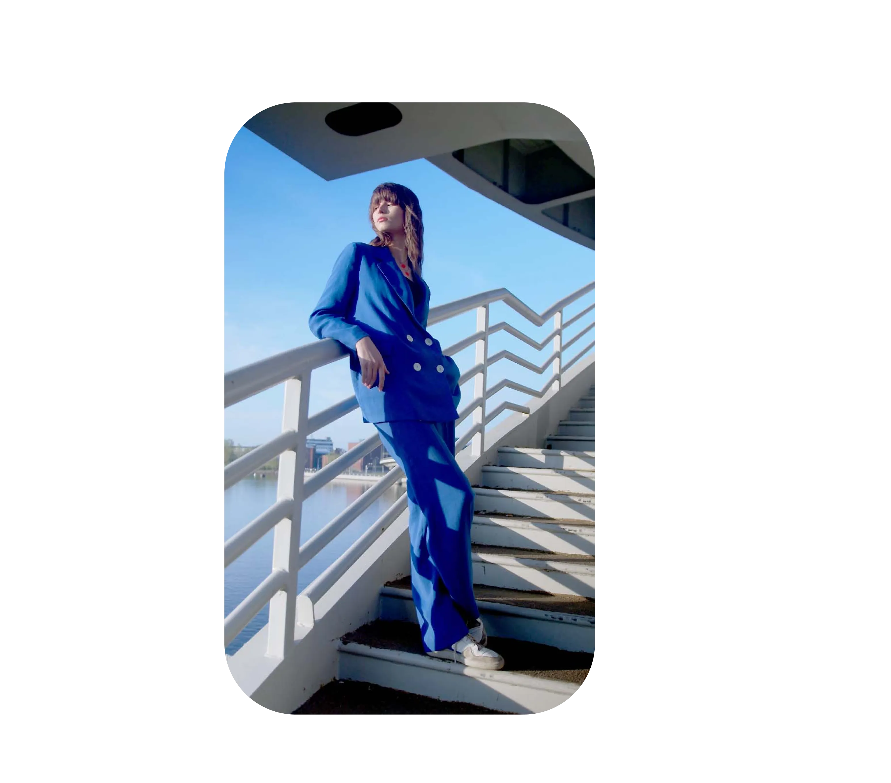


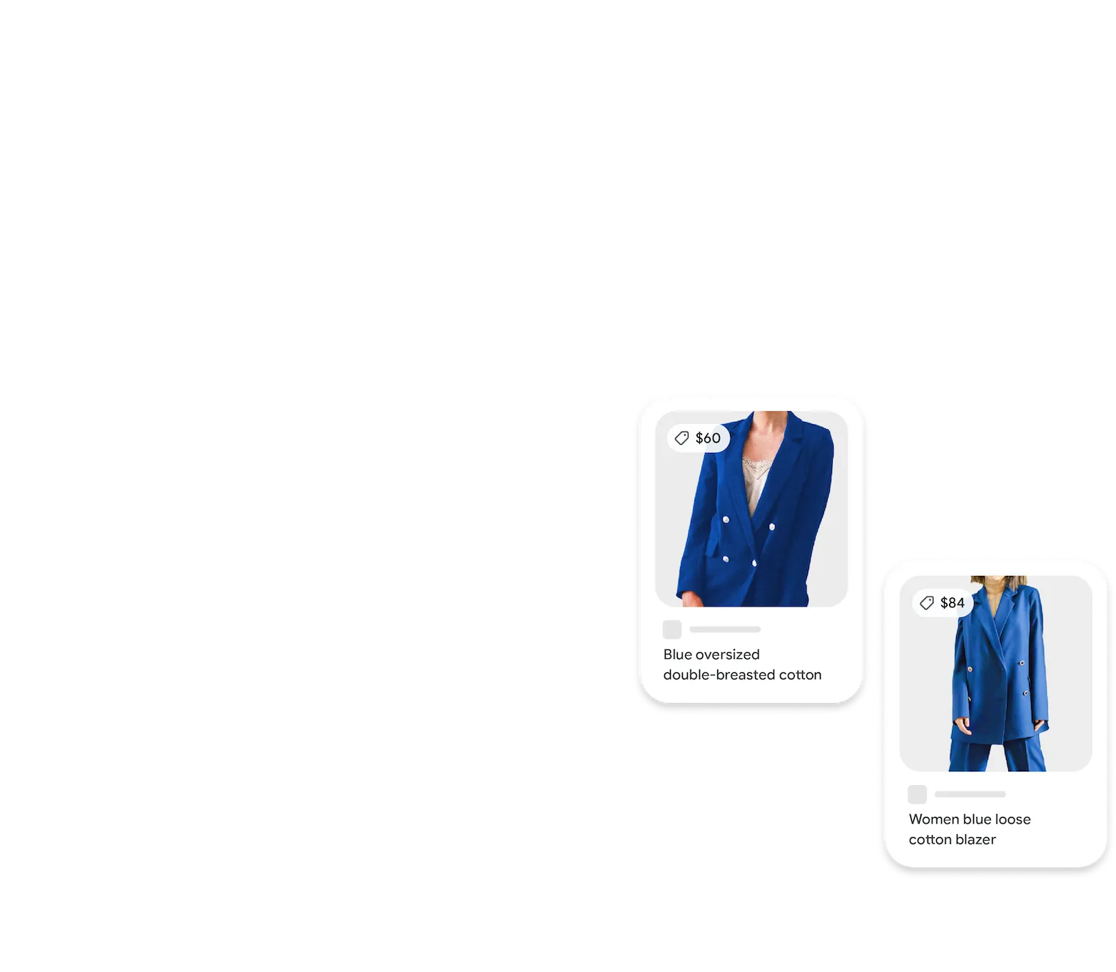


Find a look you like
See an outfit that’s caught your eye? Or a chair that's perfect for your living room? Get inspired by similar clothes, furniture, and home decor—without having to type what you're looking for.


Copy and translate text
Translate text in real-time from over 100 languages. Or copy paragraphs, serial numbers, and more from an image, then paste it on your phone or your computer with Chrome.

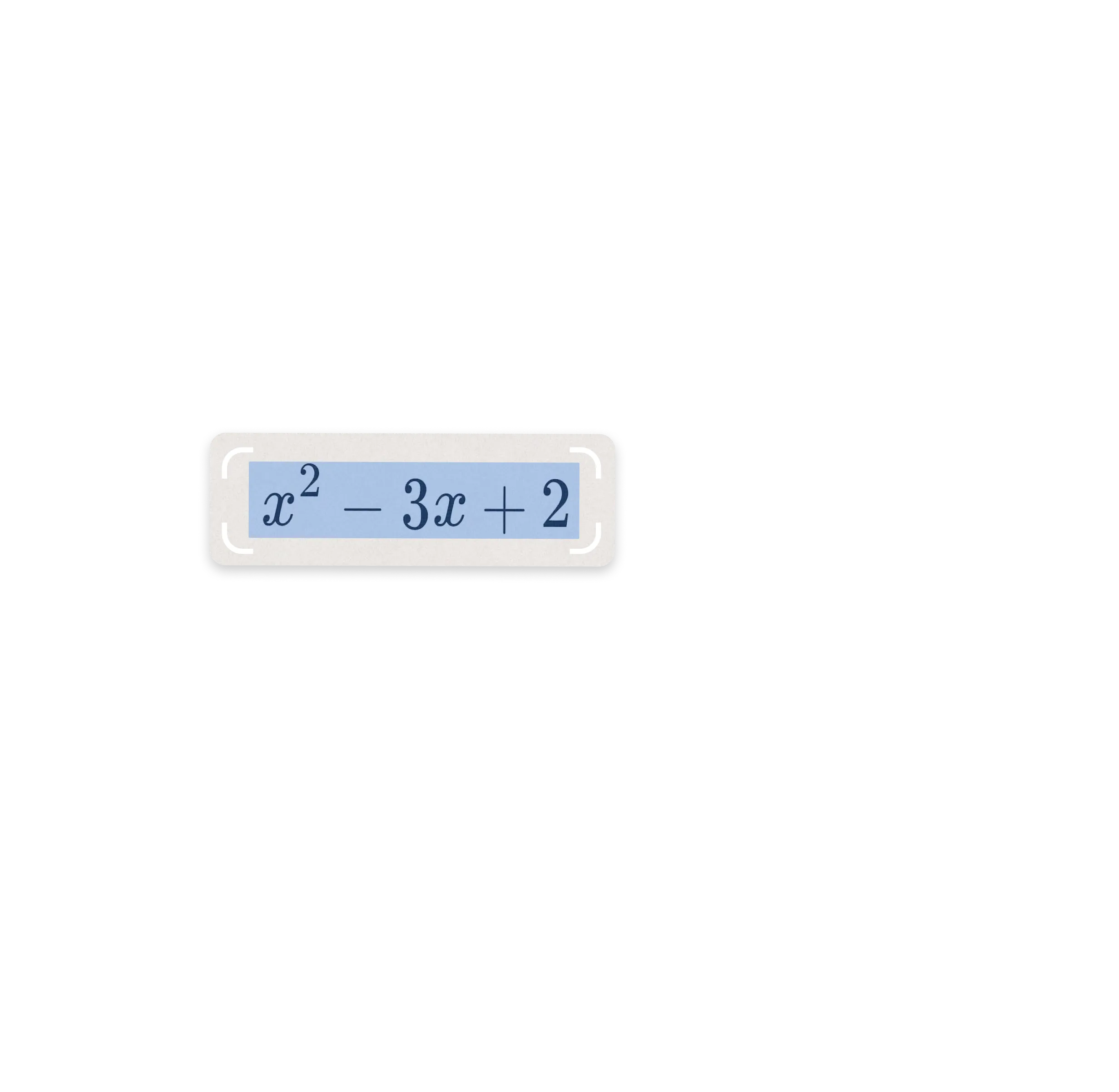
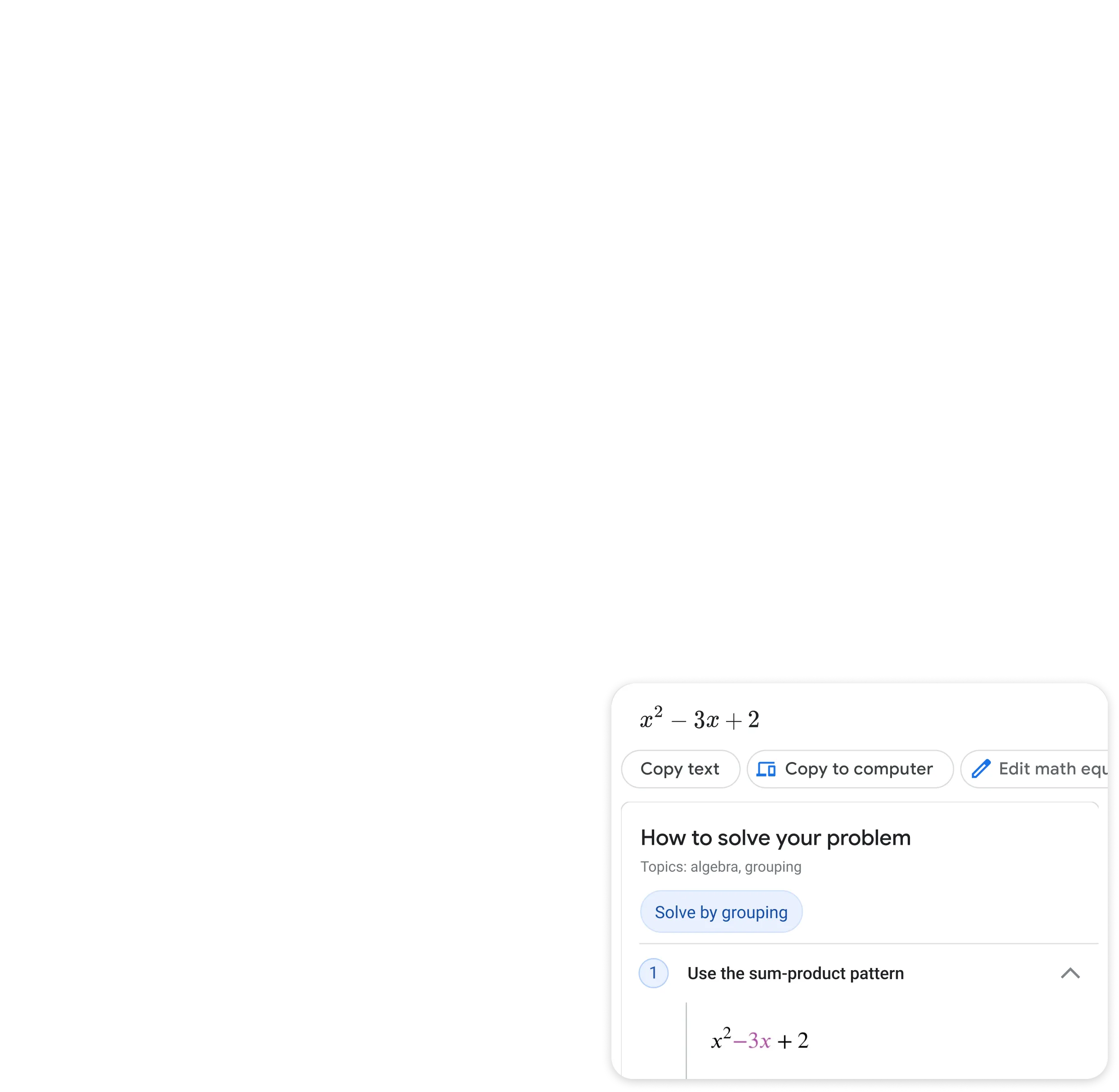
Step by step homework help
Stuck on a problem? Quickly find explainers, videos, and results from the web for math, history, chemistry, biology, physics, and more.
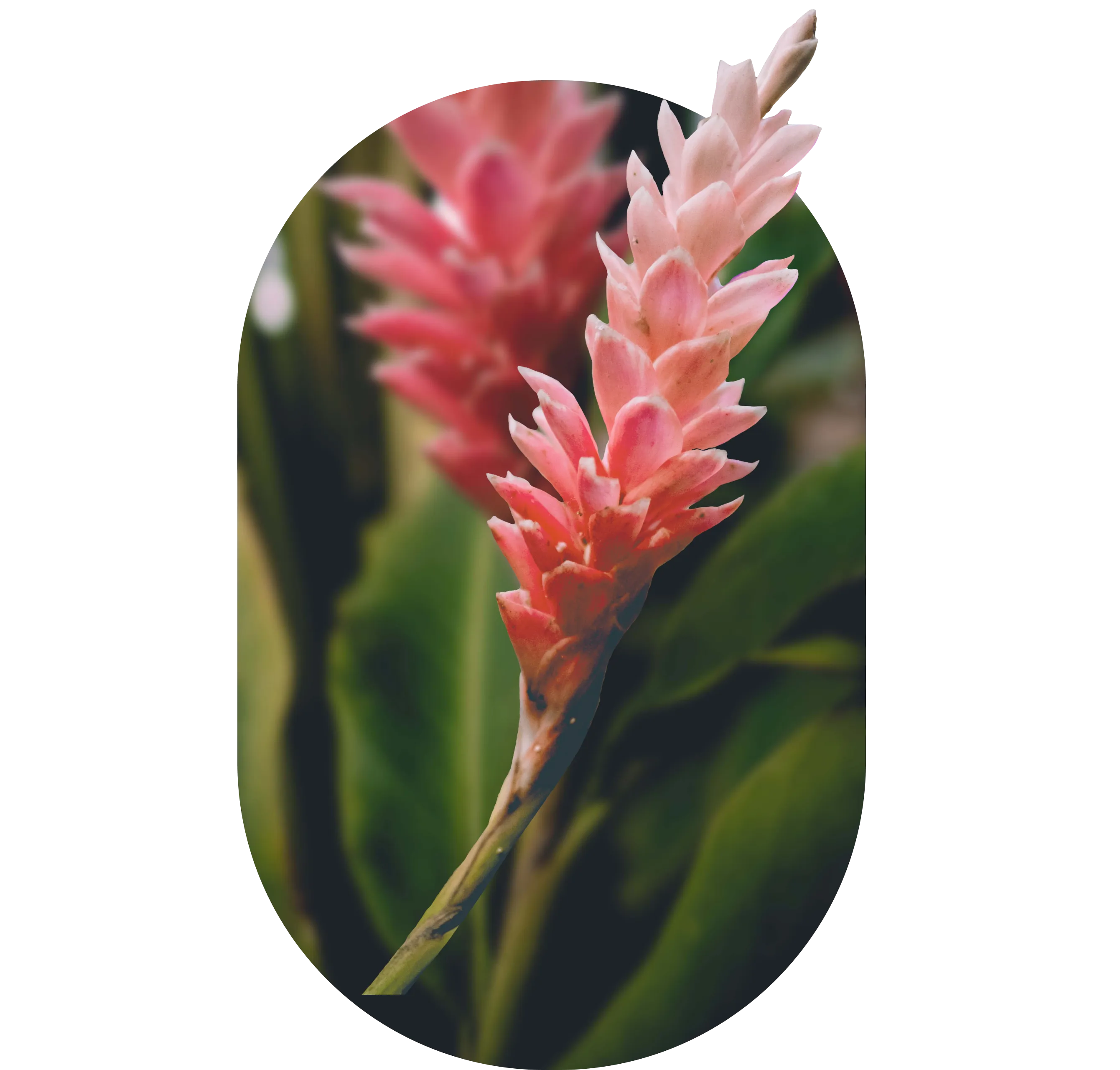


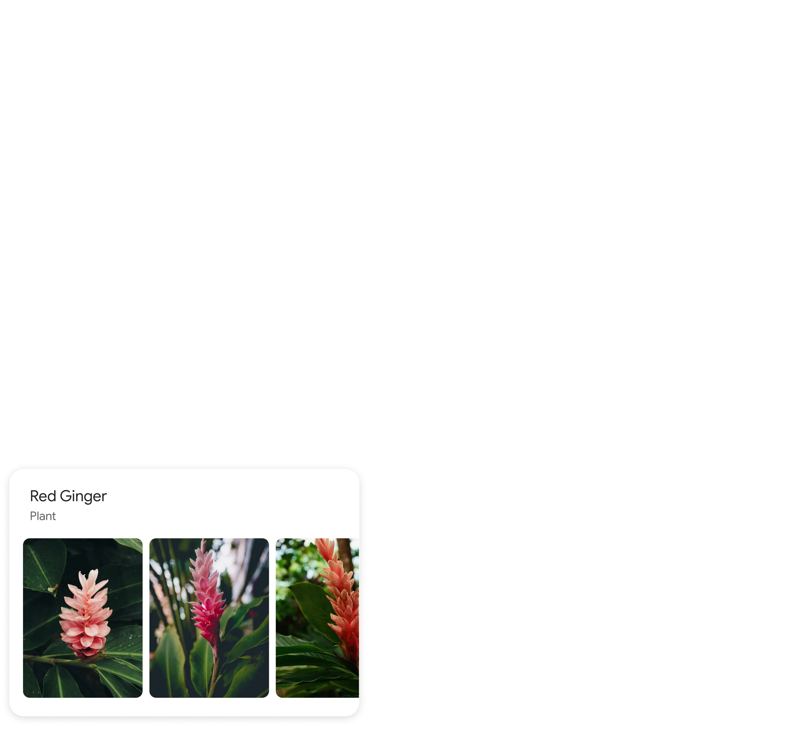
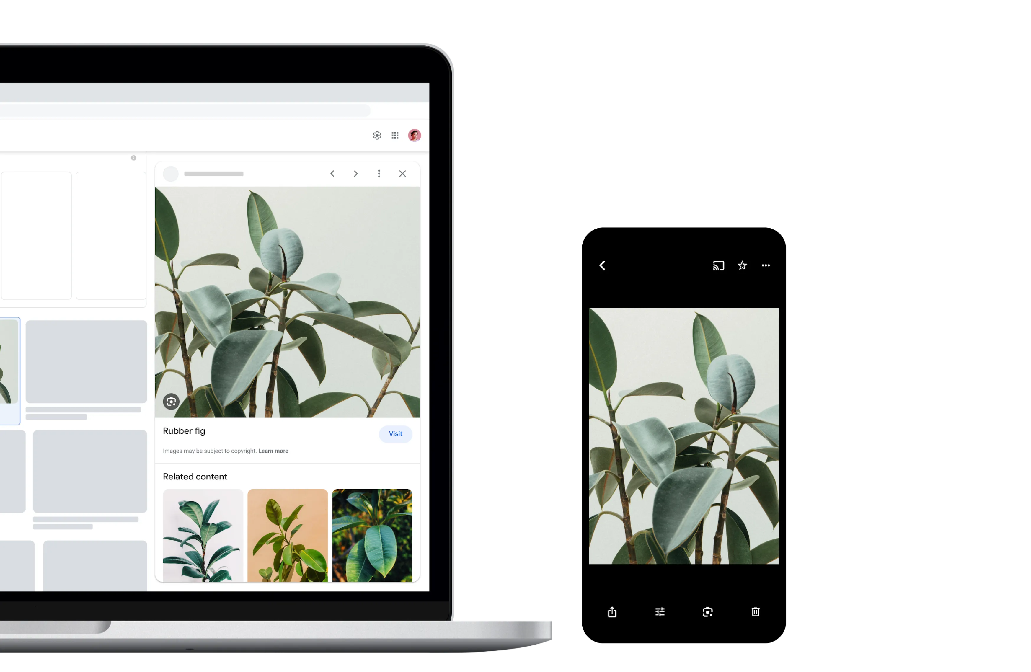
Identify plants and animals
Find out what plant is in your friend's apartment, or what kind of dog you saw in the park.

*Lens is available in Google Images
Get answers where you need them
Lens is available on all your devices and in your favorite apps.

Google app
Google Camera
Google Photos

Chrome