Question about Pareto diagram?
How to use a Pareto diagram for example an objective variable and indicate the 70% most popular investment objectives ?
How to use a Pareto diagram for example an objective variable and indicate the 70% most popular investment objectives ?
1 Answer

A Pareto diagram is a combination of two charts/graphs. It shows a bar chart of a set of data, where the bars are ranked in decreasing order, and a cumulative connected-line graph for the same data stacked over top.
The benefit for these types of diagrams is how they show both the individual values for each category and how much of the data is in the most popular categories.
Since a Pareto diagram requires two numerical axes (one for category value and another for cumulative percentage), the normal (value) scale is on the left, and the percentage scale is placed on the right.
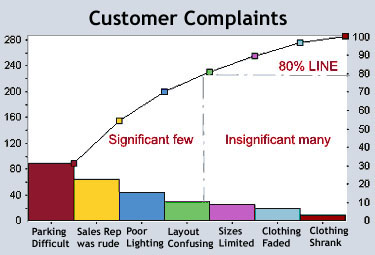
In the above example, we can see the number of customers that gave each complaint; these are the coloured bars. About 90 said "parking difficult", about 65 said "sales rep was rude", etc.
Thanks to the curved line, we can also see the percentage of the customers who gave the most popular complaints. For any percentage level we choose, we can find the most popular categories that represent that percentage of the customers.
In this case, the chart shows that 80% of the customers gave the most popular answers of "parking difficult", "sales rep was rude", "poor lighting", and "layout confusing".
The benefit of this Pareto diagram is it shows us what percentage of customer opinions we can improve by working on each category of complaint, and which are the most important. With the help of this chart, we can see how to help the largest part of the population by focusing on the fewest number of categories.
For instance, based on this chart, it would be silly to put as much effort into improving size selection as it would to improve parking. The store would likely gain 30% customer satisfaction from better parking, but only 10% from having more size selection.
