Trucks versus cars. Consumers are turning to trucks, SUVs, and mini- vans in place of passenger cars. Here are data on sales of new cars and trucks in the United States. ?
How to plot two line graphs on the same axes to compare the change in car and truck sales over time and how to describe the trend ?

How to plot two line graphs on the same axes to compare the change in car and truck sales over time and how to describe the trend ?
1 Answer
Jul 9, 2016
My choice would be to plot years along the X-axis and for each of Cars and Trucks the number of units (actually I used millions of units) sold in each of the given years.
Explanation:
Here is what my version of the graph looks like:
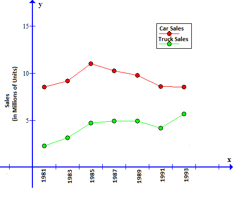
We can see that (as of 1993) the gap between car and truck sales was decreasing; car sales remained relatively constant while truck sales increased.
