Question #9d941
1 Answer

Explanation:
In simple terms, frequency tells you how many repeating cycles you get per unit of time.
#color(blue)(|bar(ul(color(white)(a/a)"frequency" = "no. of cycles"/"unit of time"color(white)(a/a)|)))#
In your case, a repeating cycle will be the period of the wave, i.e. the time needed for a single cycle to occur.
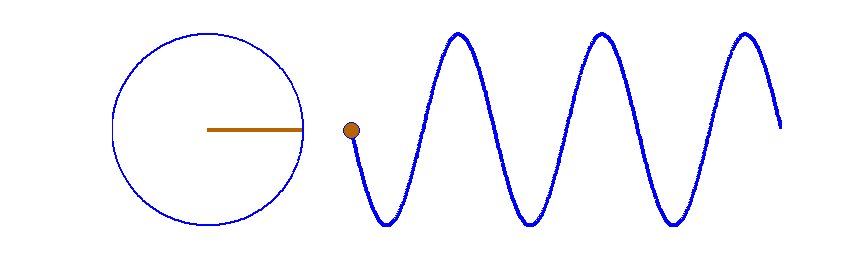
You're dealing with four waves of different periods, and implicitly of different frequencies.
The
More specifically, if you get more periods into the same period of time, you will get a higher frequency.
Notice that in order to fit more periods into the same time frame, you need to have shorter periods. This gives you the relationship that exists between frequency and period
#color(blue)(|bar(ul(color(white)(a/a)"frequency" = 1/"period"color(white)(a/a)|)))#
So, the shorter the period, the more periods you can get in the same time frame.
The more periods you can get in the time frame, the higher the frequency.
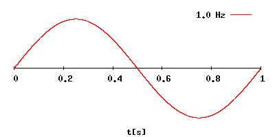
This means that graph
By comparison, graph
In fact, you can arrange these graphs in order of decreasing frequency
#"A" > "D" > "C" > "B"#
