How to draw distribution graph if pKa of acid is 4.4 and pKa of base is 6.7?
it should look like this
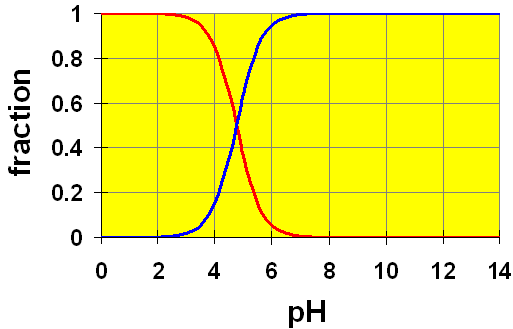
it should look like this
1 Answer

Well, these distribution graphs should correlate with the titration curve.
If we know the first
#"pH"_("1st half equiv. pt.") = "pKa"_1 + cancel(log\frac(["HA"^(-)])(["H"_2"A"]))^("Equal conc.'s, "log(1) = 0)#
#"pH"_("2nd half equiv. pt.") = "pKa"_2 + cancel(log\frac(["A"^(2-)])(["HA"^(-)]))^("Equal conc.'s, "log(1) = 0)#

We represent each stage of a diprotic acid as:
#"H"_2"A"(aq) rightleftharpoons overbrace("HA"^(-)(aq))^"singly deprotonated" + "H"^(+)(aq)#
#rightleftharpoons overbrace("A"^(2-)(aq))^"doubly deprotonated" + "H"^(+)(aq)#
The two midpoints shown are the first and second half-equivalence points, respectively.
-
At midpoint 1, we have that
#["H"_2"A"] = ["HA"^(-)]# , and that#"pH" ~~ 4.4# . -
At midpoint 2, we have that
#["HA"^(-)] = ["A"^(2-)]# , and that#"pH" ~~ 6.7# .
A distribution graph shows the change in concentration of each species in solution as the
See below for an overlay of both:
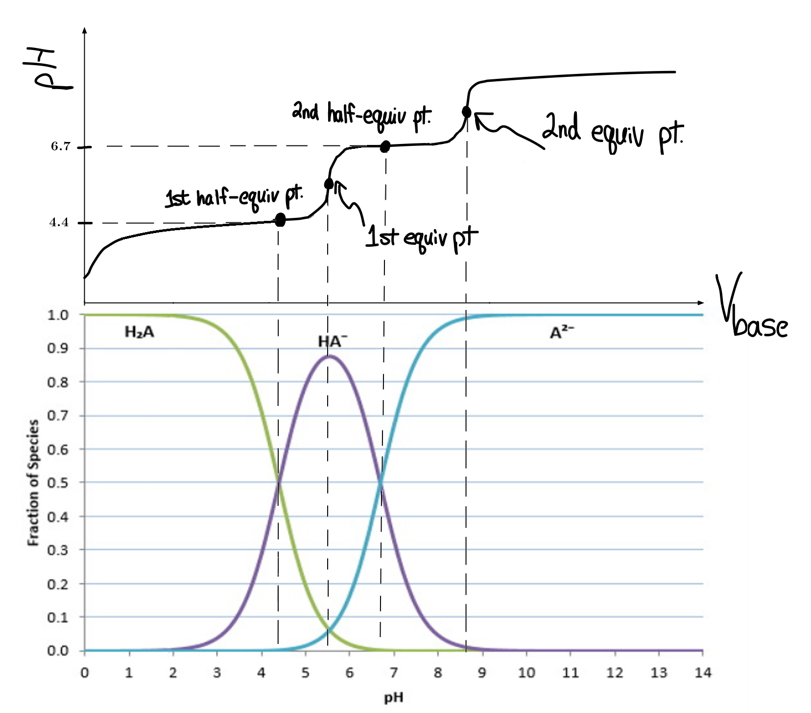
Each species in solution is tracked in the bottom graph.
-
The cross-over points on the distribution graph are the half-equivalence points on the titration curve.
-
The maximum concentration for each species after the starting
#"pH"# correlate with the first few equivalence points, and the last species to show up dominates at high#"pH"# .
