Question #38ab7
1 Answer

Find the trend line, or best fit line.
See below:
Explanation:
When you have a large number of data points (as you will in a table), it's usually pretty unlikely that all of them will be perfectly linear. As a result, you'd need to create what's called a best fit line. Here's the general procedure:
-
Graph all your data points
-
Try to find a line that goes in the general direction of your points. It does not have to touch ANY of your points, but must go in the general direction.
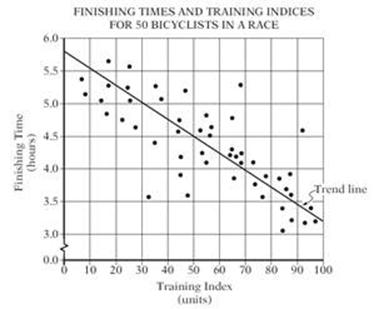
A sample:
Graphing Calculators - as well as Excel, Google Sheets and various other similar programs - can do all of the above for you if you know how.
This line will represent the "rate of change" of your data set. In most practices involving large amounts of data (everything from chemistry labs to government surveys) you will use this to not only determine a trend in your data, but to also make further predictions about it.
Hope that helps :)
