How can I do line charts in Excel?
2 Answers
- Select x-data column (Ctrl/Command + Shift + End to fast-select)
- Select y-data column (Ctrl/Command to select one cell in addition to the x-column, Ctrl/Command + Shift + End to fast-select)
- Insert > Chart > Scatter > Smooth Lined Scatter
First, watch Mr. Pauller's video on how to use Excel for linear regression.
In a line chart, the horizontal axis is a "category" axis, not a "value" axis. The points are evenly distributed along the axis.
Use a line chart if your horizontal axis uses
- Text labels or
- A small set of numerical labels representing evenly spaced intervals
Assume that you want to plot the population of bears over a number of years.
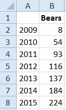
Enter your data into Columns A and B of the Excel spreadsheet.
Assume that your data are:

If you have numeric labels, as here, leave cell A1 empty. This ensures that Excel recognizes the numbers in column A as categories
Highlight the data. Click on "Insert. Charts"

Click the small triangle under Line. Select Line with Markers (the first graph in the second row).
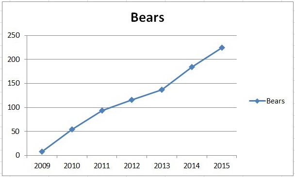
You should get a graph that looks like this.

This is your basic line chart.
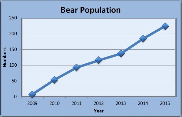
Now you can experiment with other options to improve its appearance. Here's one possibility.


