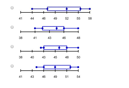
Below is a set of data representing the percentage of females in the labor force of several countries in 2010. Choose the box and whisker plot for this data set.? 44, 46, 52, 56, 58, 52, 54, 50 Options: http://prntscr.com/jf9g4q
1 Answer

May 8, 2018
N.A. See Explanation.
Explanation:
Options (for reference):
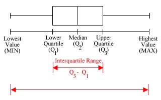
A box and whisker plot is a chart that summarises the minimum value, maximum value, lower quartile (
In a box and whisker plot:
-
The ends of the box represent the lower quartile (
Q1 ) and the upper quartile (Q3 ). -
The median is marked by a vertical line in the box.
-
The whiskers extend to the minimum and maximum values.
For the dataset
We can observe that:
- The minimum value is 44.
- The maximum value is 58.
- The median is
52+522 = 52. Q1 is46+502 = 48.Q3 is54+562 = 55.
There is no box plot that matches all the points above.
