Bar graphs are used to illustrate which type of data?
1 Answer

Dec 21, 2017
Bar graphs
Explanation:
A bar graph (or a bar chart or bar diagram) is a visual tool that uses bars to make a comparison of data among categories. A bar graph might run vertically or horizontally. The important thing to know is that the longer the bar, the greater its value.
Bar graphs consist of two axes. On a vertical bar graph the horizontal axis (or x-axis) shows the data categories, such as years. The vertical axis (or y-axis) is the scale.
Bar graphs have three main attributes:
- A bar graph makes it easy to compare sets of data between different groups.
- The graph represents categories on one axis and a discrete value in the other. The goal is to show the relation between the two axes.
- Bar graphs can also show big changes in data over time.
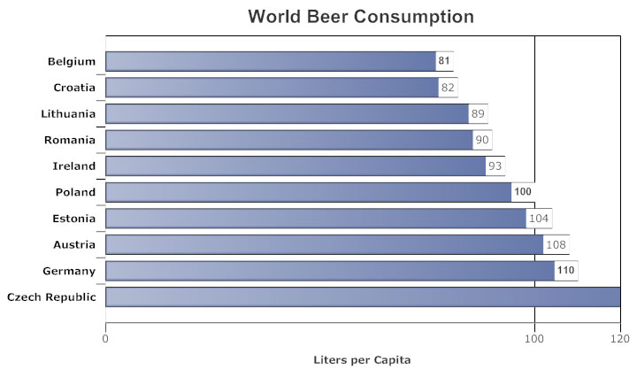
One example is provided below (Source:https://www.smartdraw.com/bar-graph/) :