How can I use the specific trendlines for a scatterplot in Excel?
1 Answer

You use a trend line to make predictions.
Explanation:
A scatter (
Assume that you own the local ice cream shop.
You keep track of how much ice cream you sell versus the noon temperature on each day and create a scatter plot with a trend line.
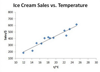
You can use the trend line to predict what your sales might be at a given temperature.
Interpolation
Interpolation is the estimation of a value within a sequence of values.
You can use interpolation to estimate your sales at 21 °C.
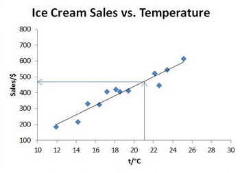
At 21 °C you should expect your sales to be about $470.
Extrapolation
Extrapolation is the estimation of a value based on extending a trend beyond an area of known values.
If you extend your trend line, you can use extrapolation to estimate your sales at 28 °C.
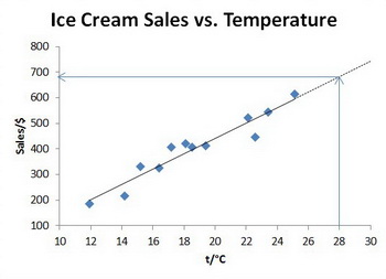
You should expect sales of about $680 if the temperature reaches 28 °C.
Using a Formula
You could also create a formula of the type
Let's estimate two points on the line near actual values: (12 °C, $200) and (25 °C, $590).
Now put the slope and the point (
Omitting the dollar signs,
Now you can use this equation to interpolate a sales value at 21 °C:
And you can extrapolate a sales value at 28 °C:
