How would you compare two box and whisker plots?
1 Answer
Please see below.
Explanation:
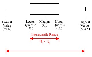
A box and whisker plot is a summarized graph summarizing, the five numbers, minimum, lower quartile, median, upper quartile and maximum.
While the portion covering lower quartile, median and upper quartile appears as a box, minimum and maximum data points show up as whiskers at the two ends (see figure below). Obviously, while its total length indicates range of the data, the size of the box indicates interquartile range.
Let us now try to compare two date sets A and B, whose box and whisker chart is given below.
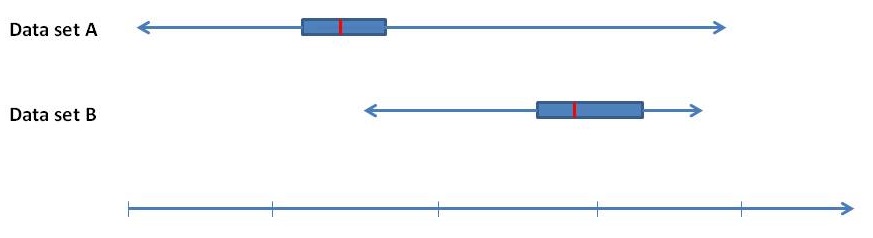
From this we observe that
(1) It is apparent that Data set A has a larger range suggesting that it has the worst and the best of the two.
(2) Further, although data set A has a higher maximum (and lower minimum), data set B has much higher median than data set A.
(3) Interquartile range of data set A is smaller, meaning data set A is more consistent around median than data set B.
