How do you make a bar chart?
1 Answer

A bar chart is also known as a bar graph or a histogram, you have values in the form of numbers that you measured from different groups and the height of the bar is equal to the value for that group.
Explanation:
For example I want to compare the height of 1st and 6th graders in a particular elementary and I want to show this visually.
I can draw a graph by first drawing the x axis and y axis (plural is axes), maybe you heard about it in math. These are two line that are perpendicular to each other (make a cross) where the x axis is horizontal and the y axis is vertical.
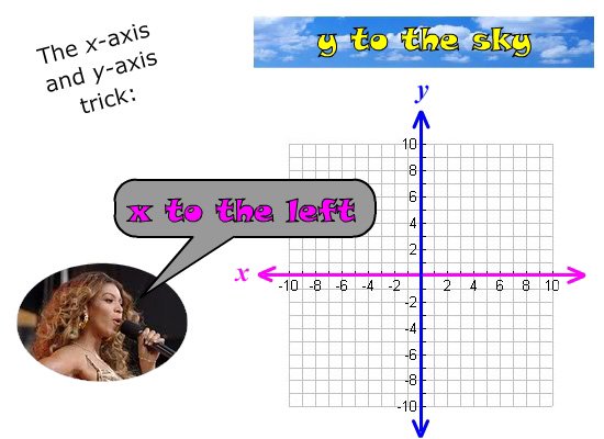 http://www.gradeamathhelp.com/x-axis-and-y-axis.html
Draw the axes so they make an L shape, the place where they meet is zero. Now think of the scale you want to use, this is the smallest to the biggest numbers shown on your graph, if the tallest student is 5 foot tall or 156 centimeters tall, so you label the y axis (vertical) 0-5 in ft or 0-156 or 0-160 cm and evenly space out lines along the axis where these numbers will go.
Also consider the number you'll put in between 0 and 5 foot, do the heights come in inches? Do I label 0,1,2,3,4,5 feet or do I write 0, 6", 1', 1'6", etc.?
Once the y axis is labelled pick a spot on the x axis to start drawing the first bar, the 1st graders' height in this case (it will be an average of all the kids in the class), draw a box whose height is the same as the value it needs to represent. Do the same for the next group but leave space between the bars. The x axis has no numbers in this case because the groups have names. colour in or shade the bars differently to tell them apart.
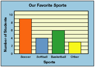
Here is a complete bar chart:
 http://www.eduplace.com/math/
If you want to make many bar charts the best thing to use is excel, read this how to, the most important thing to practice is how to enter the data:
