Nonlinear Transformations of Data
Key Questions
-
You use the logarithm function.
With logarithms (log) you reduce a multiplication (a growth factor) to an addition. E.g. every time you multiply by 2, the log goes up approx. 0.3. So a formula like 2^t becomes 0.3t, and that's a straight line.
You can do this in several ways: In the old days we used log-graph-paper. Also programs like Excel can let you plot logarithmically.I always use the following example: the smallest sound you can hear is one tree leaf moving in a very soft breeze. For a sound to hurt your ears you will need 10000000000000 times as much, with everything in between. What if we just write down the size of the number in stead of the number itself? So the one leaf (no zeroes) we write down as 0 and the greater number as 13 (zeroes). That's logarithms.
 MeneerNask
·
1
·
Dec 22 2014
MeneerNask
·
1
·
Dec 22 2014
-
Answer:
You could call it a "log-log transformation" (make a "log-log plot ")
Explanation:
If
#y# is a power function of#x# , then#y=ax^{n}# for some constants#a# and#n# . Taking the log of both sides (say, the common logarithm (base 10), but any log will do) gives#log(y)=log(ax^{n})# Using properties of logarithms, this can be written as
#log(y)=log(a)+nlog(x)# Letting
#Y=log(y)# ,#X=log(x)# , and#A=log(a)# , this equation becomes#Y=A+nX# , giving#Y=log(y)# as a linear function of#X=log(x)# .For example, suppose your data consisted of the points
#(2,6.7)# ,#(3,18.8)# ,#(4,38.4)# , and#(5,66.9)# . Plotting these data gives a definite nonlinear trend in the graph shown below.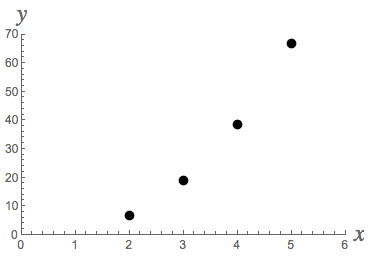
Suppose you suspect the relation between
#x# and#y# is a power function. Take the log of both the#x# - and#y# -coordinates of your data, to get#X# - and#Y# -coordinates of data for a log-log plot:#(0.301,0.826),(0.477,1.274),(0.602,1.584),(0.699,1.825)# . This plot has a definite linear trend.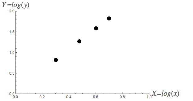
In fact, if you find the least-squares linear regression line for this second graph, you'll get approximately
#Y=0.072499+2.5106X# . This implies that#log(y)=0.072499+2.5106log(x)# so that#y=10^{0.072499+2.5106log(x)}=10^{0.072499}*10^{log(x^{2.5106})}\approx 1.18168x^{2.5106}# . The final graph shows that this is a good fit for the original#xy# -data.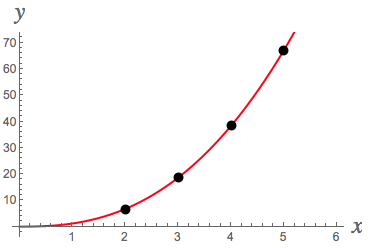
 Bill K.
·
2
·
Jun 26 2015
Bill K.
·
2
·
Jun 26 2015
-
Answer:
(1) When your data is obviously non linear.
and/or
(2) When your model is obviously non-linear.
Explanation:
There seem to me to be two main reasons to try a non-linear transformation on your data:
(1) The data itself is obviously non-linear. e.g. When plotted on a linear scale, the points follow a non-linear curve.
(2) The data pertains to a non-linear system. e.g. population growth.
If you suspect an exponential relationship like
#y = a*b^x# then try linear regression on#x# vs#log(y)# .If you suspect a power relationship like
#y = ax^b# then try linear regression on#log(x)# vs#log(y)# .If you suspect a polynomial relationship like
#y = ax^2+bx+c# and you have data points at regular#x# intervals (e.g. periodic samples), then you can use the differences between successive pairs of samples as a new sample to reduce the degree by#1# . Repeat as necessary until the resulting data looks linear. George C.
·
1
·
Jul 23 2015
George C.
·
1
·
Jul 23 2015