Question #ba70e
1 Answer

Here's how I do it using Excel 2010 for Windows. You may have to modify for your version.
First, watch Mr. Pauller's video on how to use Excel for linear regression.
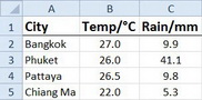
Enter your data into Columns A, B, and C of the Excel spreadsheet.
Highlight the data from A1…C5. Click on Insert Charts.
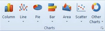
Click the small triangle under Line. Select the first option in the second row (the graph with lines and points).
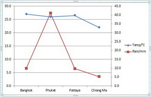
You should get a graph that looks like this.
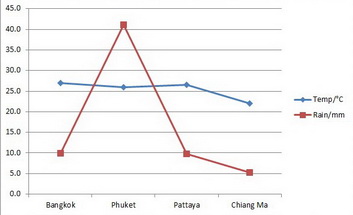
The one vertical axis is used for both temperature and rainfall.
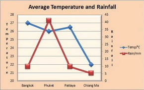
We want to add a second vertical axis, so that one axis represents temperature and the other represents rainfall.
How to add a secondary vertical axis
1. Click on a point in the Rainfall graph
This displays the Chart Tools, adding the Design, Layout, and Format tabs.
2. On the Format tab, in the Current Selection group, click Format Selection.
This displays the Format Data Point dialogue.
On the Series Options tab, click Secondary Axis and then click Close.
A secondary vertical axis is displayed in the chart.
This is your graph with two axes.
Now you can use the usual tools of Excel to edit the appearance of the graph by adding titles for the chart and axes, changing the axis options, etc.
Here is one possibility.