How do I create a bar chart?
1 Answer

Jan 21, 2016
One way is to use Microsoft Excel.
Explanation:
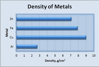
Bar charts are good for comparing values for different groups of things.
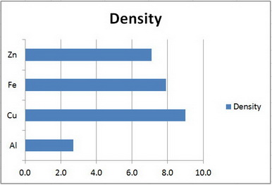
Let's assume that your class has measured the density of some metals and you want to display the results in a bar chart.
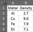
Open EXCEL and enter your data.
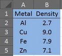
Highlight your data
Click on the Insert tab to show the Charts options
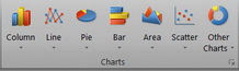
Click on the triangle below "Bar" and select "2D Bar".
The Bar Chart magically appears.
Edit your chart to improve its appearance.
Click on the "Density" legend on the right, and press "Del".
You should also add Axis Titles and perhaps change the Chart Title (click anywhere in the graph, choose "Chart Tools" and "Layout").
You can even add colours and change appearance by using "Design" and "Format".
Here's an example.