What does the graph #r = sqrt(sintheta)# look like in plane polar coordinates? How do you graph it?
1 Answer

It should look like this:
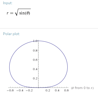
In polar coordinates, you have a radius
So, to plot the graph, measure the angle from the righthand horizontal, and acquire the radius at that angle; that's one point on the graph. This function is valid in
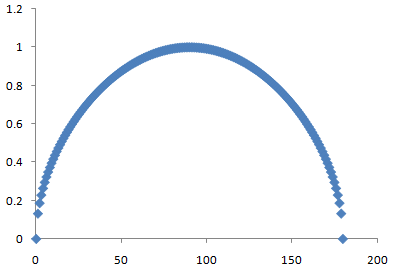
You can get an idea for how the value of
assuming
#r# is only vertical.
But that's not how the graph actually looks; in actual polar coordinates,
So, take the above graph, which plots vertical
In other words, take your finger and use the origin as an axis of rotation. Then, sweep through the first two quadrants (I,II) from the righthand horizontal to the lefthand horizontal, which traces
This distorts the above graph so that the endpoints are at
Here is this GIF to illustrate what is happening with

And so, the resultant graph looks like a squashed bouncing ball in slow motion:
