Sign Charts
Key Questions
-
Answer:
Please see below.
Explanation:
Sign chart is used to solve inequalities relating to polynomials, which can be factorized into linear binomials. For example, of the type
#(ax+b)(gx+h)(px+q)(sx+t)>0# It could also be less than or less than or equal or greater than or equal, but the process is not much effected.
Note that these can be written as
#(x-alpha)(x-beta)(x-gamma)(x-delta)>0# (here
#alpha=-b/a# ,#beta=-h/g# ,#gamma=-q/p# and#delta=-t/s# )Note that numbers
#alpha# ,#beta# ,#gamma# and#delta# divide real number in five intervals. (Note at these values, value of polynomial will be zero.)For example, if they are already in increasing order, these are
#(-oo,alpha)# ,#(alpha,beta)# ,#beta,gamma)# ,#(gamma,delta)# and#(delta.oo)# .In these intervals, we can find that each of these linear binomial i.e.
#(x-alpha)# ,#(x-beta)# ,#(x-gamma)# and#(x-delta)# take up either a positive or negative value,and hence the polynomial (as it is a product of these linear binomials) will take positive or negative value
and can easily check the intervals, where the inequality is satisfied, giving us the result.
As an example, one may like to see solution to this question. .
Shwetank Mauria · 1 · Jan 16 2017
-
An inequality is simply an equation where (as the name implies) you don't have an equal sign. Rather, inequalities deal with more nebulous greater than/less than comparisons.
Let me use a real life example to communicate this.
You buy 300 chickens that you're going to cook at your restaurant tonight for a party. Your across-the-street rival Joe looks at your purchase and responds "tut tut, still a lot less than what I have," and walks away with a smirk.
If we were document this mathematically using an inequality, we'd get something like this:
Chickens you have
#<# Chickens Joe hasRemember the crocodile mouth from elementary school? That is pretty much all of what inequalities are about.
Now we also have what are called inequality functions. And those, as you may have guessed, simply look much like this:
#y< x# Of course, the croc's mouth could be pointing both ways, and we could also have a
#<=# sign, which simply means "less than or equal to."The graphs of these functions look very much like linear equations, as you can see below:
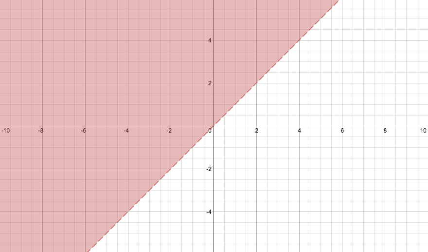
This graph represents the equation#y > x# 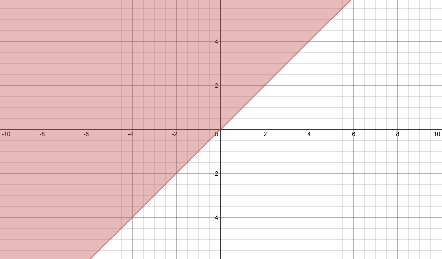
This graph represents the equation
#y >= x# As I mentioned before, inequality equations look very much like linear ones. However, if you notice, there's a shading on the left hand side of both graphs, and a dashed line on the
#y > x# graph.This is simply because when you have an inequality, there is a vast range of solutions that can satisfy the equation, a range not limited to a line. In the case of
#y >= x# , it's not just the coordinates on the line#y=x# , but everything to the left of that as well.In addition, with the
#y>x# graph, it is only everything to the left the line#y=x# . It does not include the line itself. Hence, the line is dashed to indicate that it is not included in the function.Hope my overly-thorough explanation helps :)
 Darshan Senthil
·
·
Sep 13 2014
Darshan Senthil
·
·
Sep 13 2014